There’s a specific kind of frustration that comes from searching for free stock photos.
You see it immediately, even in the thumbnail. The pose that nobody actually holds in real life. Clothes that belong to no particular era or person. Flat light that comes from nowhere. A prop that stopped feeling current years ago. And nothing matches anything else… because the images were never made together.
You close the tab and keep looking…
This is not a list of platforms. This is about learning to recognize the difference.
I started Kaboompics at a time when stock photography was dominated by a very specific kind of thinking.
The people making stock photos weren’t coming from fine art or editorial photography. They were coming from utility — what sells, what covers a keyword, what fills a brief. The goal was literal communication. A photo about “teamwork” showed people literally working as a team, usually in a way that would make any art director wince.
What nobody predicted was what happened next. Access to photography equipment became easier, and a whole generation of visual creators emerged — people who genuinely cared about light, composition, and mood. I’ve watched this happen in real time, and honestly, it went the opposite direction from what most people expected. The level of photography didn’t drop as cameras became more available. It went up. Dramatically.
The audience changed with it. People developed a visual vocabulary. They started recognizing — and rejecting — the cringe. Using a generic stock photo stopped being neutral. It started saying something about your brand. Something you probably didn’t want it to say.
For any brand building around aesthetics, using the wrong image isn’t just a missed opportunity. It actively works against you.


These are the things I notice immediately. Some of them I learned the hard way — I have my own weaker moments in my photography archive, and time has made those mistakes much easier to see.
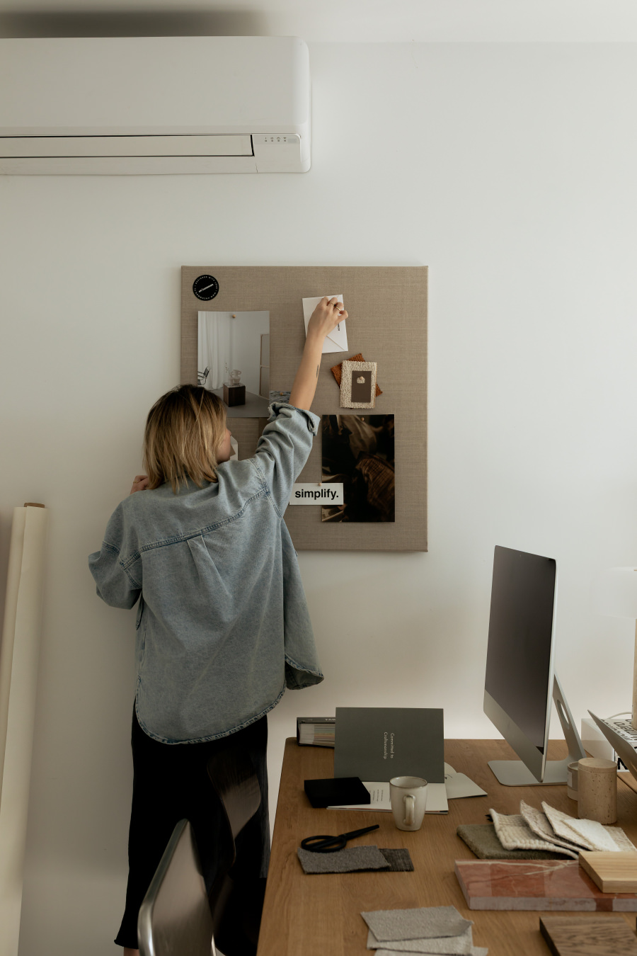
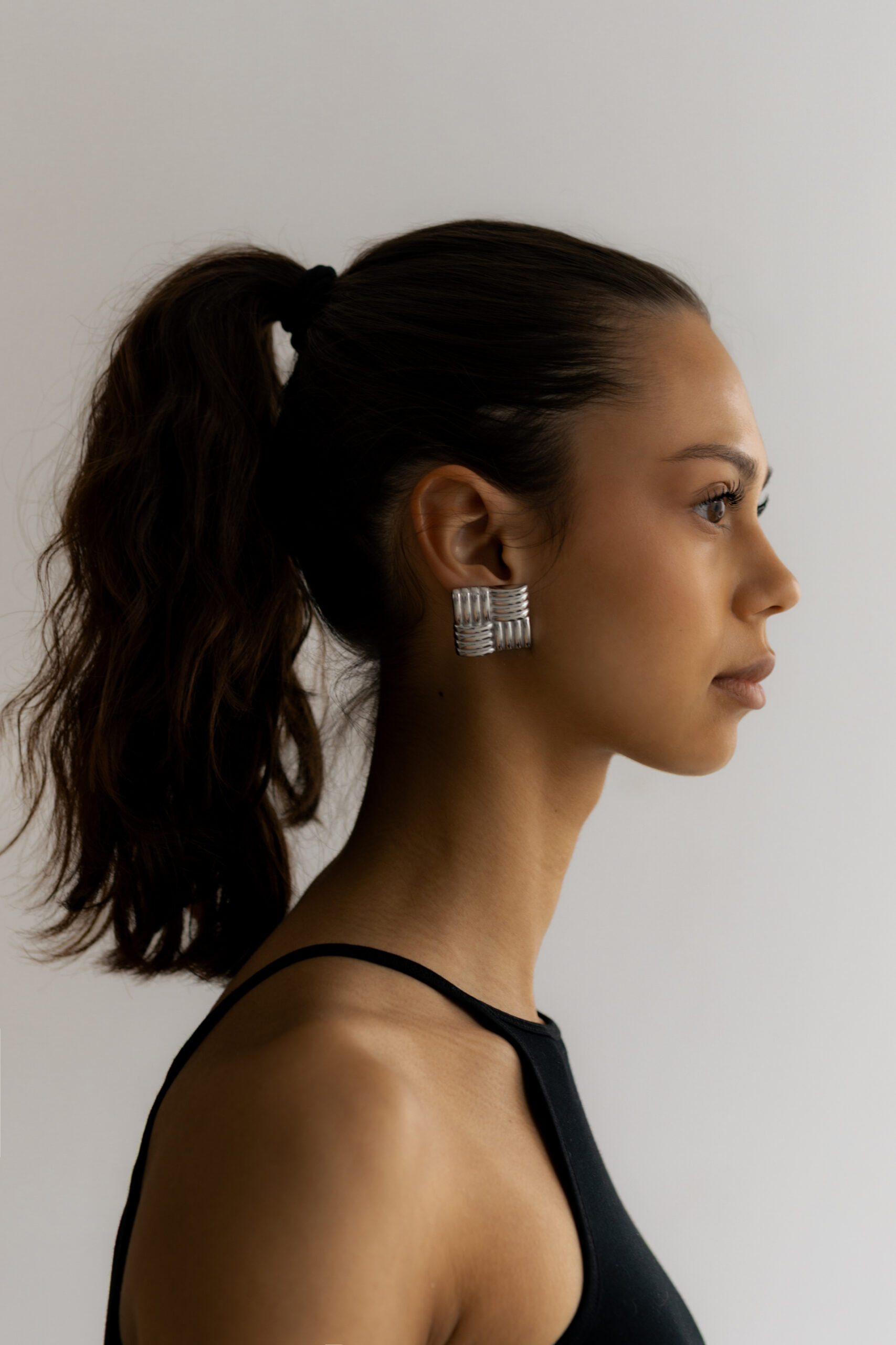
When people appear in stock photos, they’re often dressed for a concept rather than for their actual life. The outfit is too neutral, too deliberate, too obviously chosen to offend nobody. There’s a difference between someone who is dressed and someone who is wearing clothes. Good stock photography features the second kind — real outfits, considered color choices, actual style. When a model looks costumed rather than dressed, the whole image collapses.
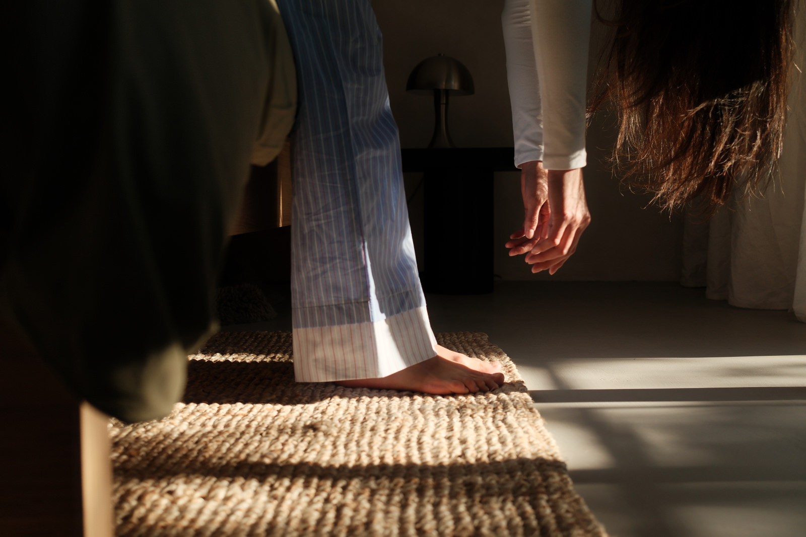
Flat, overexposed studio lighting is the fastest way to date a stock photo. I’ve always believed that imperfect natural light beats perfect artificial light. A slightly underexposed room with one good window will almost always feel more real than a technically correct three-point studio setup. Light that comes from somewhere — that has a direction, a quality, a temperature — is light that tells you something about the world the photo lives in.
Cringe stock photos have a particular repertoire: the arms-crossed power pose, the forced laugh, the handshake that nobody in real life ever photographs. Faces that are performing an emotion rather than experiencing one. The remedy isn’t always to go fully candid — it’s to go quieter. Softer. Let the person exist in the frame rather than demonstrate something for it.
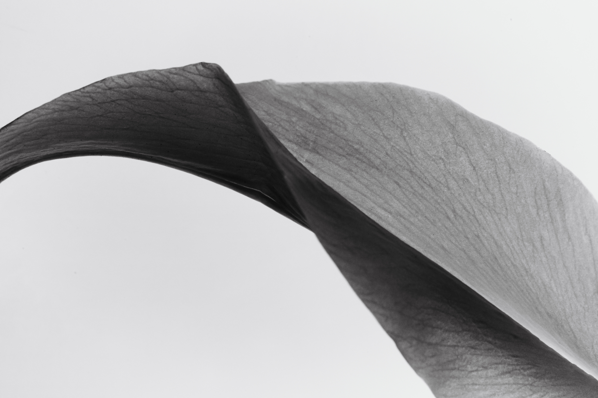
The worst stock photos are illustrations of their own keywords. They show you exactly what the brief said, with nothing withheld, nothing left to interpretation. Good photography — including good stock photography — holds something back. There’s space in the frame. There’s something the image suggests rather than states.
Here’s what I’ve learned from years of making it and watching what works.
I can see this in our own statistics. Images with sun rays, with shadows that fall across part of the frame, with a portion of the image in darkness — these get significantly more clicks than technically correct, evenly lit alternatives. People respond to light that does something. A shot where part of the frame is in shadow isn’t a failure of exposure. It’s a photograph that has atmosphere.
A single strong image is useful. A set of images that share a palette, a mood, a way of seeing the world — that’s something you can actually build with. This is why I built Kaboompics around photoshoots rather than individual photos. Visual coherence doesn’t happen by accident, and it’s very hard to fake by collecting images from different sources.
We’re entering a period where imperfection is becoming the point. Film grain, slightly soft focus, the particular color cast of natural light through old glass — these qualities are increasingly desirable because they signal authenticity in a way that pixel-perfect digital photography can’t. I think this direction is only going to deepen. The images that feel most current right now are often the ones that look least like they were made to look current.
Knowing what you’re looking for changes how you search. A few things that help:
“Woman working” gives you a thousand versions of the same image. “Warm morning light interior” gets you somewhere more interesting. The more you describe an atmosphere rather than a subject, the closer you’ll get to images that have a point of view.
Color coherence is one of the fastest ways to make a collection of images feel intentional. If you know your brand’s palette, use it as a search filter before anything else. It eliminates a huge amount of noise.
If you find one image you like, look for what it was shot alongside. Images made together share light, proportion, and visual logic in a way that assembled collections never quite replicate.
If something about an image feels slightly off and you can’t name why — the pose, the expression, the way the colors sit together — trust that feeling. Your visual instincts are probably right. The goal isn’t to find an image that will do. It’s to find one that feels correct.


The cringe era of stock photography isn’t over, but it’s ending. Audiences have developed enough visual literacy to recognize generic images on sight — and to associate them with brands that don’t care about how they look.
Finding better images isn’t about knowing which platforms exist. It’s about knowing what you’re looking at.
Look for real light. Look for people who are dressed rather than costumed. Look for images that suggest something rather than illustrate it. Look for coherence — between images, between palette, between mood.
When you find a photographer or platform whose images consistently feel right, stay there. Visual consistency is the hardest thing to build when you’re pulling from everywhere.
At Kaboompics, everything is organized by photoshoot rather than individual image — because that’s how visual coherence actually works. Browse by collection, filter by color, and take the whole set rather than just one frame.
Browse free collections at kaboompics.com →
And if you need something beyond the free library — mockups, video — the Kaboompics shop is built with the same visual logic.
All images on Kaboompics are free to use, including for commercial projects. No attribution required.
If you’ve ever saved an image from Pinterest and posted it on Instagram, you’re definitely not alone. It’s one of the most common habits online, and at the same time, one of the most misunderstood. So can you use Pinterest
Many designers, bloggers, and marketers say they want stock photos that look “editorial.” The phrase shows up in briefs, emails, and conversations all the time. It sounds very clear, but when you actually try to define it, things get a

Short answer: yes, but not in the way most people assume. The conversation around AI images hasn’t flipped upside down since 2025, but it has matured. The hype faded a bit and what’s left is more concrete: clearer legal signals,